Free Online Palette Tool

Color Palette Generator
Powered by color theory

Create balanced five-color palettes for websites, branding, UI design, and creative projects. Choose a color harmony, lock the shades you like, check contrast, preview color blindness, and export your palette to CSS, Tailwind, JSON, SVG, or PNG.

Free to use. No signup or download required.

Quick Start

How to Create a Color Palette Online

Start with one base color and build related colors around it using a color harmony. You can then lock the swatches you want to keep, regenerate the others, test contrast, and export the finished palette for your website, brand, or UI project.

  1. Choose a starting color. Enter a HEX value or select a color visually.
  2. Select a color harmony. Try complementary, analogous, triadic, monochromatic, split-complementary, or tetradic.
  3. Generate and refine. Lock the colors you like and regenerate only the remaining swatches.
  4. Validate the palette. Check contrast and preview the colors with color-vision simulations.
  5. Export your colors. Move the finished palette into CSS, Tailwind, SCSS, JSON, SVG, or PNG.
Start Creating a Palette

Choose the Right Color Harmony

Color harmony describes how colors relate to each other on the color wheel. The right harmony depends on whether your design needs strong contrast, subtle variation, visual consistency, or a wider range of distinct colors.

  • Complementary — colors from opposite sides of the color wheel for strong visual contrast and prominent accents.
  • Analogous — neighboring hues that create a softer, more connected visual style.
  • Triadic — three evenly spaced hues that provide variety while maintaining visual balance.
  • Tetradic — four related hues for designs that need a wider and more expressive color range.
  • Split-Complementary — useful when you want contrast without the intensity of a direct complementary pair.
  • Monochromatic — variations of one hue for simple, consistent interfaces and brand systems.

Refine and Lock Colors in Your Palette

Found a color that works? Lock it before generating again. Only the unlocked swatches will change, which lets you refine a palette gradually instead of starting from scratch after every generation.

  • Press L to lock/unlock the selected color
  • Keyboard navigation with ← → arrow keys
  • Press C to copy HEX to clipboard
  • Ctrl+Z / Ctrl+Shift+Z for undo/redo (30 states)

Inspect HEX, RGB, HSL and Other Color Values

Open any palette color to inspect the values you may need for design or development. Copy individual formats directly, explore lighter tints and darker shades, and use the same color consistently across different tools and workflows.

  • HEX, RGB, HSL, HSB, CMYK, LAB, LCH, XYZ, LUV, HWB
  • Color name detection against a curated name database
  • Tints & shades scale (10 lighter + 10 darker variations)
  • Gradient preview derived from palette colors

How to Create an Accessible Color Palette

An accessible palette needs more than attractive swatches. Text, buttons, links, form controls, icons, and other important interface elements must remain readable and distinguishable against their backgrounds.

For WCAG 2.2 contrast guidance, normal text generally needs a contrast ratio of at least 4.5:1 for Level AA, while large text needs at least 3:1. Level AAA uses a higher 7:1 ratio for normal text.

  • Check text against its actual background color.
  • Test buttons, links, form controls, and important states.
  • Preview colors for common color-vision deficiencies.
  • Do not rely on color alone to communicate errors, warnings, success states, or other important information.
  • Test the palette inside real UI components before finalizing it.

Quick Contrast Reference

AA Normal Text

Minimum contrast: 4.5:1

AA Large Text

Minimum contrast: 3:1

AAA Normal Text

Minimum contrast: 7:1

Preview Your Palette for Color-Blind Users

Colors that look clearly different to one person may appear much more similar to someone with a color-vision deficiency. Preview the complete palette before using color differences for navigation states, charts, buttons, badges, alerts, or other important interface elements.

  • Protanopia (red-blind)
  • Deuteranopia (green-blind)
  • Tritanopia (blue-blind)
  • Achromatopsia (complete color blindness)

Export Your Palette to CSS, Tailwind, JSON, SVG and PNG

Move your final colors directly into design and development workflows instead of rebuilding the palette manually. Copy developer-ready variables or download visual formats for documentation, handoff, and sharing.

CSS Variables Tailwind Config SCSS Variables JSON SVG PNG Image Share URL
Practical Color System

How to Choose a Color Palette for a Website

A useful website palette gives every color a clear job. Start with a small set of core colors, then expand them into lighter and darker variations only when the interface needs them.

Give Every Color a Purpose

  • Primary color: important brand elements and main actions.
  • Secondary color: supporting elements and secondary actions.
  • Accent color: highlights and elements that need attention.
  • Background and surface colors: pages, navigation, cards, panels, and modals.
  • Text colors: headings, body copy, labels, and secondary text.
  • Semantic colors: success, warning, error, and informational states.

How Many Colors Should a Website Palette Have?

There is no fixed number for every website. A good starting point is a small core palette with clearly defined roles rather than many unrelated colors.

Once the core palette works, create lighter and darker variations for hover states, focus states, borders, disabled controls, backgrounds, and other interface requirements.

Test combinations in real buttons, text, navigation, forms, cards, and backgrounds before deciding that a palette is finished.

Inspiration

Color Palette Ideas for Websites, Brands, and UI

Use these common design directions as a starting point, then adjust the colors and contrast for your own brand, interface, and accessibility requirements.

Modern SaaS Palette

A useful starting direction for dashboards, SaaS products, and modern web interfaces.

Warm Brand Palette

A warm direction for lifestyle brands, editorial designs, and creative projects.

Dark UI Palette

A high-contrast starting point for dark dashboards, apps, and developer-focused products.

Soft Pastel Palette

A softer visual direction for illustrations, landing pages, and friendly brand systems.

Generate Your Own Palette
Real Product Screenshots

How to Build and Test a Color Palette Step by Step

Use the real product workflow below to see how a palette moves from a starting color to harmony generation, refinement, accessibility checks, detailed color values, and production-ready export.

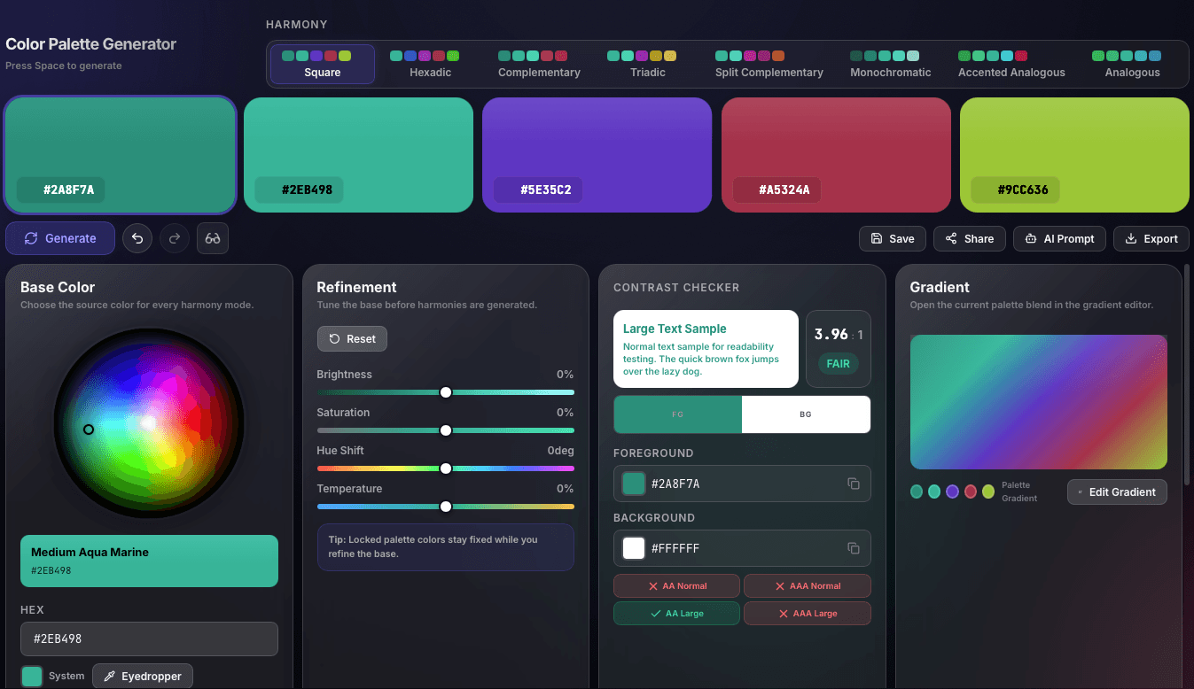
Full palette generator screenshot showing the palette row, refinement controls, contrast checker, and linked gradient preview.
Ship

Validate contrast and push the palette into related tools

The full workspace combines harmony generation, contrast checking, and a linked gradient preview so a finished palette can move straight into gradients, exports, and implementation workflows.

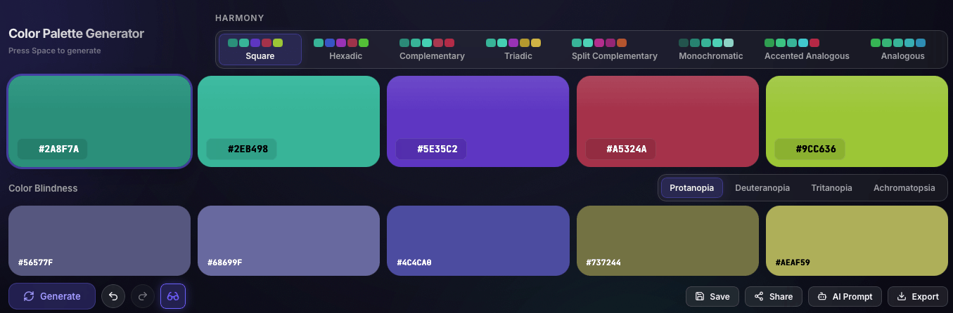
Palette generator screenshot showing harmony controls, a generated five-color palette, and color-blindness simulation tabs.
Generate

Choose a harmony mode and generate your first palette

Start with a harmony family such as Square, Complementary, Triadic, or Analogous, then compare the resulting five-color palette with its color-blindness simulation before committing to a direction.

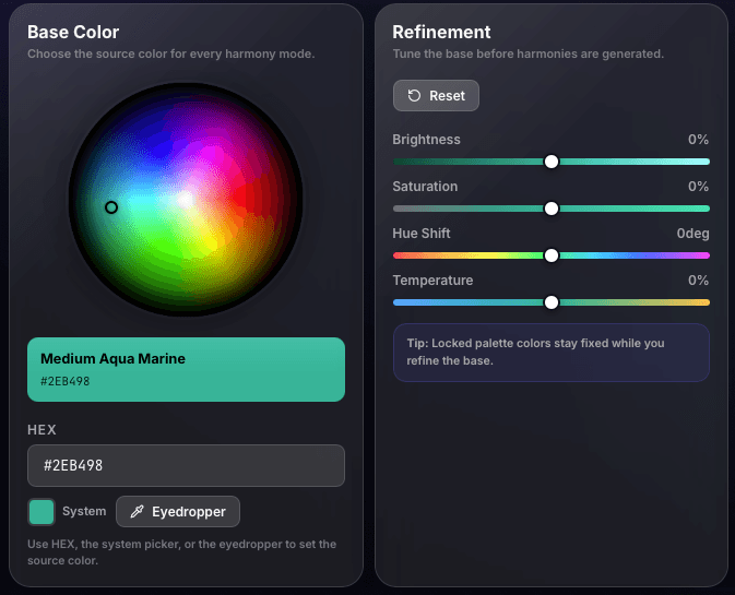
Palette generator refinement screenshot showing the base color wheel, HEX field, eyedropper, and refinement sliders.
Tune

Refine the base color before regenerating harmonies

Use the wheel, HEX input, eyedropper, and base-color refinement controls for brightness, saturation, hue shift, and temperature so locked palette colors stay aligned with your intended direction.

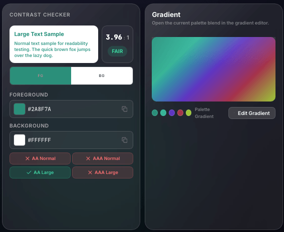
Palette generator screenshot showing the contrast checker panel beside the linked gradient preview.
Validate

Check contrast and preview the linked palette gradient

Before exporting, users can verify foreground and background readability, confirm AA and AAA states, and inspect how the current palette blends inside the linked gradient editor.

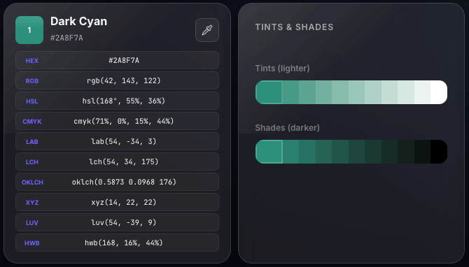
Palette detail screenshot showing detailed color formats, tints, and shades for a selected palette color.
Inspect

Open full color details, tints, and shades for any swatch

The detail view surfaces formats like HEX, RGB, HSL, LAB, LCH, OKLCH, and more, then extends the chosen swatch into lighter tints and darker shades for production handoff.

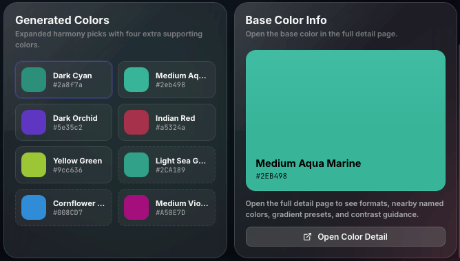
Palette generator screenshot showing generated supporting colors and a base color info panel.
Expand

Review supporting colors and base color information

Generated supporting colors help users expand beyond the original five swatches while the base color info panel gives a focused place to inspect the source color and jump into a deeper detail page.

Use Your Palette in Branding, Web Design, and UI Systems

A useful palette should move easily from color exploration into real design work. Refine your core colors, build shade scales, extract colors from visual references, or turn your palette into production-ready gradients.

  • Brand design: build primary, neutral, and accent colors from one starting hue
  • UI systems: validate accessible combinations before handing tokens to developers
  • Creative exploration: test rainbow color palette directions, monochrome sets, and bold complementary palettes
  • Production handoff: continue into the Tailwind color generator or the CSS gradient generator without rebuilding colors

Related color tools

Color Palette Generator FAQ

Quick answers about creating color palettes, choosing color harmonies, checking accessibility, locking colors, and exporting palettes for web, branding, and UI projects.

It helps you create a group of colors that work well together for websites, branding, UI design, illustrations, presentations, and other visual projects.

Start with a base color, choose a harmony such as complementary, analogous, triadic, monochromatic, split-complementary, or tetradic, then generate related colors around it. Lock the colors you like and regenerate the remaining swatches.

Most websites work best with a small core palette. Start with primary, secondary, accent, background, surface, and text colors, then create lighter or darker variations for hover states, borders, disabled elements, and other UI needs.

Check the contrast between foreground and background colors, test important text and controls, preview common color-vision deficiencies, and avoid using color alone to communicate important information.

Use complementary colors for strong contrast, analogous colors for a softer connected look, triadic colors for balanced variety, monochromatic colors for consistency, and split-complementary or tetradic palettes when you need a broader range of hues.

Yes. Lock any swatch you want to keep and regenerate only the unlocked colors until you find a combination that works for your design.

Yes. The palette generator includes simulations for protanopia, deuteranopia, tritanopia, and achromatopsia so you can compare how your colors may appear with different forms of color-vision deficiency.

Yes. You can export your finished palette as CSS variables, Tailwind config, SCSS, JSON, SVG, PNG, and other formats for design and development workflows.

Create Your Color Palette

Start with one color, explore different harmonies, lock your favorite swatches, check contrast, and export the finished palette when it is ready.

Open Free Palette Generator

Free to use. No signup required.