Build Better Tailwind Color Systems

Tailwind Color Generator
for Custom 50–950 Shades

Generate custom Tailwind CSS colors from 50 to 950, preview them in real UI, check contrast, and export production-ready @theme, CSS variables, or Tailwind v3 config — free, with no signup.

✓ 11 Tailwind shades ✓ OKLCH + HEX ✓ WCAG contrast ✓ v4 + v3 export
Live palette preview
#7C3AED Brand violet · base shade 500
Generate
50
100
200
300
400
500
600
700
800
900
950
Tailwind v4CSSv3 config
@theme {
  --color-brand-50:  oklch(...);
  --color-brand-500: oklch(...);
  --color-brand-950: oklch(...);
}
50 → 950Complete 11-step color scale
3 export pathsTailwind v4, v3 and CSS
10+ formatsHEX, OKLCH, RGB, HSL and more
FreeNo login or signup required
From one color to a full system

Generate Custom Tailwind CSS Colors from Any HEX

Start with a brand color, HEX value, color wheel selection, or screen sample. The Tailwind color generator expands your base color into an 11-step scale from 50 to 950, giving you lighter colors for surfaces and backgrounds, mid-range colors for primary UI elements, and darker shades for text, hover states, and dark interfaces.

  • Generate all 11 Tailwind shades from 50 through 950 in real time
  • View HEX and OKLCH values for modern Tailwind CSS workflows
  • Compare your generated scale with the closest official Tailwind color family
  • Preview the palette across real UI components before implementation
  • Copy individual shades, CSS variables, Tailwind v4 theme tokens, or a Tailwind v3 config block
shade-50 shade-100 shade-200 shade-300 shade-400 shade-500 shade-600 shade-700 shade-800 shade-900 shade-950

Shade system explained

Tailwind CSS Colors: Understanding the 50–950 Scale

Tailwind CSS colors use a numbered shade system from 50 to 950. Lower numbers are lighter, while higher numbers become progressively darker. A complete Tailwind color palette contains 11 shades: 50, 100, 200, 300, 400, 500, 600, 700, 800, 900, and 950.

Use lighter shades for backgrounds and subtle surfaces, middle shades for brand colors and interactive elements, and darker shades for text, active states, and dark-mode interfaces.

Shade rangeCommon UI use
50–100Backgrounds and subtle surfaces
200–300Borders, dividers, and disabled UI
400–500Icons, brand accents, and primary actions
600–700Hover, active, and focus states
800–950Text, headings, and dark UI surfaces
Copy. Paste. Ship.

Export Tailwind Colors for v4, v3, or CSS

Move from generated colors to implementation without rewriting tokens by hand. Export your palette for Tailwind CSS v4, Tailwind CSS v3, or framework-independent CSS variables.

Tailwind CSS v4 (@theme)
@theme {
  --color-brand-50:  oklch(...);
  --color-brand-500: oklch(...);
  --color-brand-950: oklch(...);
}
Tailwind CSS v3 (tailwind.config.js)
// tailwind.config.js
module.exports = {
  theme: {
    extend: {
      colors: {
        'brand': {
          50:  '#fdf2f8',
          500: '#ec4899',
          950: '#500724',
        },
      },
    },
  },
};
CSS Variables
:root {
  --color-brand-50:  #fdf2f8;
  --color-brand-500: #ec4899;
  --color-brand-950: #500724;
}
Modern Tailwind workflow

Tailwind CSS v4 Colors and OKLCH

Tailwind CSS v4 uses a CSS-first configuration model, so custom design tokens can be defined directly in CSS with the @theme directive. This makes generated colors easier to move into modern Tailwind projects without relying only on a JavaScript config file.

The tool also exposes OKLCH alongside familiar formats such as HEX, RGB, and HSL. OKLCH is useful for modern color systems because it represents lightness, chroma, and hue in a perceptual color space and fits naturally into current Tailwind workflows.

@import "tailwindcss";

@theme {
  --color-brand-50:  oklch(...);
  --color-brand-500: oklch(...);
  --color-brand-950: oklch(...);
}
Preview before production

Use Your Custom Tailwind Colors in Real UI

Generated shades are more useful when you can map them to real interface states. Use lighter tones for surfaces, middle shades for primary actions, and darker shades for readable text and dark-mode components.

Primary button
bg-brand-500
hover:bg-brand-600
text-white
Card surface
bg-brand-50
border-brand-200
text-brand-900
Dark interface
bg-brand-950
text-brand-100

Pick a Starting Color with the Wheel or Eyedropper

Choose a starting color visually, paste a HEX value, or sample a visible pixel from your screen. Every change immediately updates the custom Tailwind color scale, so the picker supports the generation workflow without becoming the page's main focus.

  • Full 360° hue selection by position on wheel
  • Brightness and saturation controlled by distance from center
  • Touch-friendly — works perfectly on mobile and tablet
  • HEX input syncs dot position and Tailwind scale in real-time

Sample a Screen Color with the Browser EyeDropper

Click the Eyedropper button and pick any color from anywhere on your screen — other browser tabs, your Figma designs, reference images, anything visible. The picked color instantly feeds into the Tailwind CSS scale generator.

  • Works on Chrome, Edge, and Opera (EyeDropper API supported)
  • Picks from any pixel on screen — not just the app window
  • Tailwind scale regenerates instantly from the picked color
  • Combine with palette slot assignment to build full brand systems

HEX, RGB, HSL, OKLCH and More

The Color Information panel updates as you pick, giving you familiar web formats plus modern color values for Tailwind workflows. Click any row to copy the value to your clipboard.

HEX OKLCH RGB HSL LAB LCH CMYK XYZ LUV HWB

Color name detection maps your picked color to the closest named CSS color or Pantone-like name from a curated database of 2000+ color names.

Accessibility built in

Check Contrast Before Using Tailwind Colors

A useful Tailwind color scale needs to work in real interfaces, not only look balanced as a row of swatches. Compare foreground and background combinations, review the contrast ratio, and identify shades that work better for normal text, large text, buttons, and UI surfaces.

  • Computed contrast ratio (e.g. 4.5:1 minimum for AA)
  • Live text preview at normal and large sizes
  • Tints & shades scale — 20 variations from dark to light
  • Apply any Tailwind shade directly to a palette slot
Real Product Screenshots

See the Tailwind Color Workflow in Action

These screenshots use the actual app interface, showing the full path from selecting one base color to previewing, validating, and exporting a complete Tailwind-ready color system.

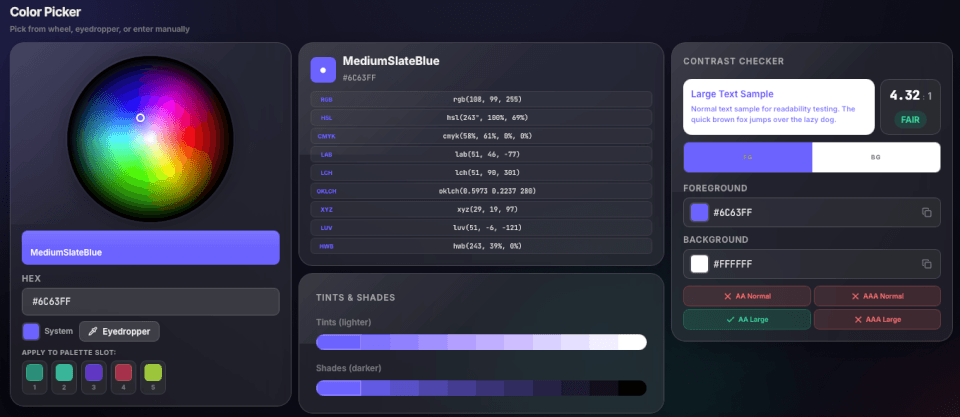
Color picker app screenshot showing the wheel picker, color formats, tints and shades, contrast checker, and palette slots.
Pick

Choose a source color and validate it instantly

Start with the wheel, the eyedropper, or manual HEX input. The app immediately shows every key color format, a live contrast checker, tints and shades, and palette-slot assignment for broader workflows.

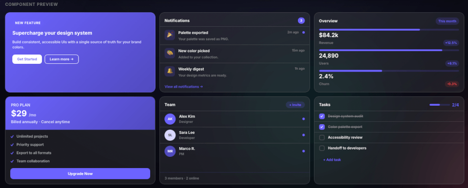
Component preview screenshot showing cards and dashboard modules styled with the selected color system.
Preview

Preview Tailwind Colors on Buttons, Cards, Dashboards, and UI

See how your Tailwind colors behave before adding them to production. Preview lighter shades on surfaces, brand colors on buttons and accents, and darker shades across text, cards, dashboards, and interface states.

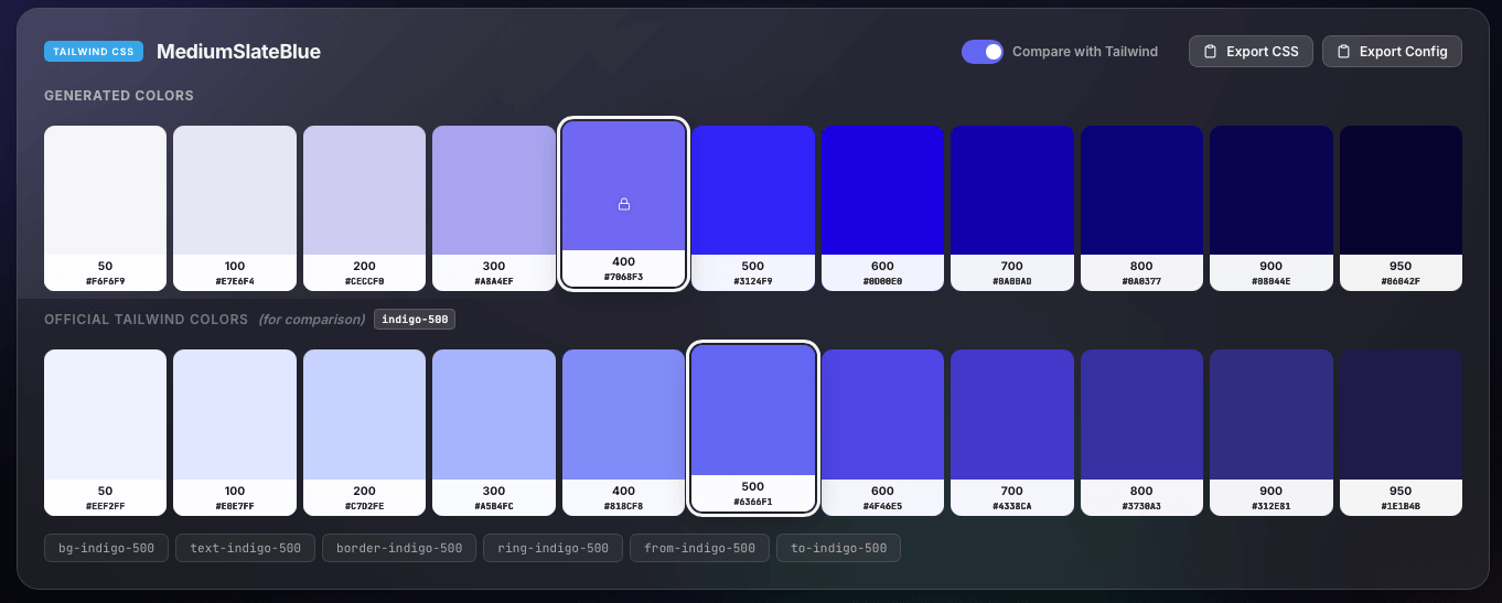
Tailwind comparison screenshot showing generated 50 to 950 colors, official Tailwind comparison, and export buttons.
Generate

Build a Full 50–950 Tailwind Scale and Compare It

Once the base hue is chosen, the tool expands it into shades 50 through 950, compares the generated family with the closest official Tailwind palette, and exposes one-click export actions for CSS and config output.

Use Custom Tailwind Colors in Design Systems and UI Projects

Use this Tailwind color generator when you need more than a single HEX value. It connects color selection, accessible shade building, UI preview, and implementation so designers and developers can work from one source color.

  • UI UX design: test interface colors before adding them to a design system
  • Web design: move from a color wheel decision to CSS-ready tokens without manual shade building
  • Front-end development: generate Tailwind-compatible scales and validate WCAG contrast in one place
  • Brand systems: turn a primary brand color into reusable product, marketing, and documentation shades

Related tools

  • Need multiple brand colors instead of one 50–950 scale? Use the Color Palette Generator to build a broader color system.
  • Starting from a logo, screenshot, or photo? Extract a HEX value with the Color Picker From Image, then generate its Tailwind scale.
  • Turn your finished Tailwind colors into backgrounds and interface effects with the CSS Gradient Generator.

Tailwind Color Generator FAQ

Common questions about Tailwind CSS colors, 50–950 shades, v4 @theme exports, v3 config, OKLCH, and accessibility.

Choose a base HEX color, use the wheel, or sample a screen color with the EyeDropper. The tool expands that color into a complete Tailwind-style 50 to 950 scale for interfaces, design systems, and front-end projects.

Export the generated colors as Tailwind CSS v4 theme variables and place them inside an @theme block in your CSS. Your custom color tokens can then be used through Tailwind utility classes.

Yes. You can also copy a ready-to-paste tailwind.config.js color object for Tailwind CSS v3 projects, alongside CSS variables for framework-independent use.

Tailwind color families use 11 numbered shades from 50 to 950. Lower numbers are lighter and work well for backgrounds and subtle surfaces, while higher numbers are darker and are useful for text, hover states, and dark interfaces.

OKLCH is a perceptual color format used by modern Tailwind CSS palettes. The tool shows OKLCH alongside familiar formats such as HEX, RGB, and HSL so colors can move into current Tailwind workflows more easily.

Use the built-in contrast checker to compare foreground and background combinations, review the contrast ratio, and select shades that work better for normal text, large text, buttons, and UI surfaces.

Generate Your Custom Tailwind Colors

Start with any HEX color and generate a complete 50–950 Tailwind CSS scale with accessibility checks and ready-to-use export options. Free, no login.

Generate My Tailwind Palette